Play+ Design System: A Manifesto for Design That Breathes
Play+ Design System: A Manifesto for Design That Breathes
🌱 The Soul & Foundation
This is the official playbook for the Play+ Design System. It's more than a guide—it's the blueprint for how we bring our philosophy of design that breathes to life. We don't build interfaces; we create ecosystems.
Play+ is founded on a simple, radical idea
Software should feel less like a machine and more like an extension of human intent. It should be a partner that anticipates, a canvas that inspires, and a tool so intuitive it disappears. We reject rigid, lifeless design. Instead, we chase a new standard: the living interface—an experience that flows, adapts, and responds with intelligence and grace.
This isn't about adding features; it's about removing friction until all that's left is pure, unhindered momentum.
This is our craft
Design that breathes

🧬 Our Foundation: From Brand Values to Design Principles
Play+ is a direct expression of Ascendion's core brand values. Every principle, material, and component in our system is derived from this foundation, ensuring our brand's soul is embedded in every interaction.
[Placeholder for Diagram]
A visual diagram or flow chart should be placed here to illustrate the relationship. The diagram would show how our foundational Ascendion Values inform the strategic Play+ Pillars. These pillars, in turn, are expressed through our sensory Elemental Soul (Glass, Liquid, Light), which are finally implemented through tangible Key Design Principles that guide our daily work.
🧭 Value-to-Experience Mapping
| Ascendion Value | Play+ Pillar(s) | Elemental Soul | Key Design Principles | Example Behavior |
|---|---|---|---|---|
| Boldly Optimistic | Distinct, Engaging | Light (illumination), Liquid (momentum) | Expressive Typography, Colors, Motion | Buttons pulse gently on load, typography scales with context |
| Deeply Empathetic | Inclusive, Intuitive | Glass (clarity), Light (natural feedback) | Accessibility, Human-centric Content, Micro Layouts | Input fields provide inline feedback with soft glows and voice-ready labels |
| Relentlessly Curious | Adaptive, Engaging | Liquid (flow), Glass (layering, discovery) | Adaptability, Macro Layouts, Exploratory Motion | Carousels reveal content on swipe/scroll with fluid motion between layers |
| Ally | Inclusive, Intuitive | Glass (predictability), Light (guidance) | Supportive Content, Task-focused Layouts, Accessibility | Breadcrumbs light up progressively with each task step, emphasizing safe progress |
💎 The Material Signature: Our Elemental Language
Glass
Liquid

Light

✨ The Core Pillars: Our Unchanging Principles
Pillars define the unchanging principles that form the "Core Signature" of the Play+ experience. They are the strategic guideposts for every design and development decision.
 Adaptive
 Intuitive
 Inclusive
 Distinct
 Engaging
Pillar Matrix: Philosophy → Function → Emotion
| Adaptive | Interfaces must respond fluidly to context and user needs | Responsive layouts, reflowing containers, touch/keyboard input parity | Ease, freedom, flexibility |
| Intuitive | Design should reduce friction and empower action | Clear hierarchies, smart defaults, minimal cognitive load | Confidence, clarity, trust |
| Inclusive | Everyone deserves equal access, comfort, and respect | WCAG 2.2 AA, reduced motion options, accessible components, localization readiness | Belonging, empathy, dignity |
| Distinct | The brand should shine through every interaction | Consistent tokens, visual signature (glass/light), strong identity cues | Recognition, emotional connection, authenticity |
| Engaging | Interactions should energize and reward, never distract | Subtle motion, micro-interactions, animated feedback, transitions | Delight, joy, emotional continuity |
💠 Signature Styles: Our Authentic Expression
Glassmorphism

Metamorphic
Signature Scaling
🌸 Emotional Guidance: The Feeling of Interaction
Hover → Anticipation
The system acknowledges attention with a soft cue, inviting action without urgency.
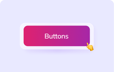
Press → Satisfaction
The press state delivers confirmation with tactile grace, simulating a sense of control.
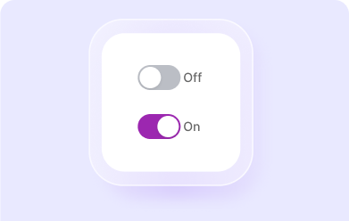
Toggle → Agency
Switching states feels empowering—affirmative, not binary. Smooth, expressive transitions signal that the system is listening.
Modal Open → Focused Immersion
Entering a modal should feel like stepping into a quiet, well-lit room. Focus is amplified, distractions fade.
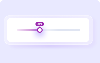
Motion → Continuity and Comfort
Motion connects moments. Enter, exit, and transition states should feel effortless, guiding the user through time and intent.
These interaction feelings are mapped to specific motion tokens and component states across the system—anchoring emotion in systematic behavior.
🍀 From Philosophy to Practice
Tokens and Theming
Design tokens map to color, radius, elevation, spacing, motion, and feedback states.
Accessible Defaults
Contrast ratios, tap targets, keyboard navigation, reduced-motion variants, and screen reader semantics are all built in.
Developer Harmony
Component libraries for React, Angular, and Web Components ensure consistency without friction.
Performance by Design
Motion is hardware-accelerated, styles are atomic and purged, and theming respects light/dark modes and system preferences.
📐 Key Design Principles
These principles are the tactical application of our pillars and elemental soul. They translate philosophy into real-world execution.
| Principle | Description | Linked Pillar(s) | Linked Element(s) |
|---|---|---|---|
| Motion | Motion connects, guides, and delights. It should never distract. | Engaging, Adaptive | Liquid, Light |
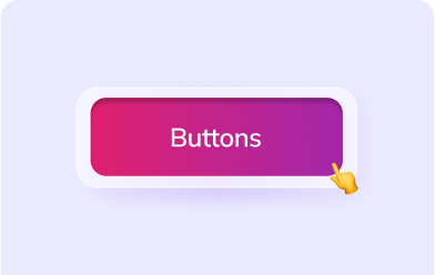
| Colors | Color communicates hierarchy and emotion. It should be bold yet purposeful. | Distinct, Boldly Optimistic | Light |
| Expressive Typography | Typography reflects tone and clarity. It balances character with function. | Distinct, Intuitive | Light |
| Icons | Icons are fast, universal cues. They simplify meaning when used consistently. | Intuitive, Inclusive | Light |
| Accessibility | Design must respect every user’s ability. Inclusion is non-negotiable. | Inclusive | Glass, Light |
| Layouts (Micro & Macro) | Structure is clarity. Grids and flow enable narrative and usability. | Adaptive, Intuitive | Glass, Liquid |
| Content Strategy | Content is interface. Tone, clarity, and intent must always align. | Intuitive, Empathetic | Glass |
🌬️ Design That Moves With You
Play+ is our design system with a soul. A system where design isn't just built—it breathes. Where materials aren't static—they react. And where style isn't surface—it's embedded into the behavior and emotion of every interaction.
Design that feels human. Components that feel alive.
This is Play+.